Server Icon
written by Scribble
There has been quite a few changes to our server icon, each with an interesting history!
Creation of the current icon
The beginning
Back when there was only an MT as the “server icon”, we struggeled to find a fitting icon for Minecraft TASing: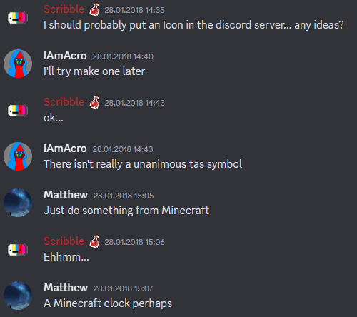
Having a clock as an icon wasn’t actually a bad idea, however “only” a clock seemed a bit lame to me.
2 days after I created the server, I was invited to a CTM-Speedrunning Discord (which you can find in Discords),
which had the following server icon: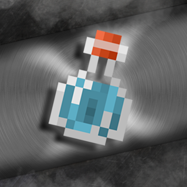
I took some inspiration from that and in a few minutes I created this:
After presenting the idea, Pesud came up with the following:
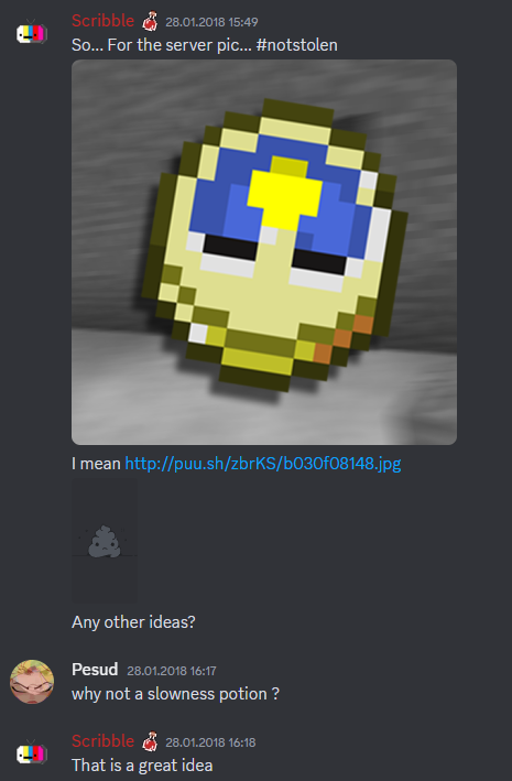
And so, from here on out, our icon was decided.
For anyone not getting the slowness potion, TASers mainly use slow motion and tickadvance to make our TASes…
So I came up with our first server icon: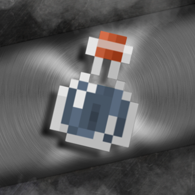
Now, both of our discords actually had matching icons, which was cool to look at, at least if you were on both servers.
Following the lead
The other server soon noticed the matching icons and after a while the admin and creator of the speedrunning potion Gunther joined our server.
They were making some changes to the speedrunning icon, by zooming in on the potion and then went out of their way to also do the same with the slowness potion, which was just wholesome.
And henceforth, this slightly altered icon was the new one: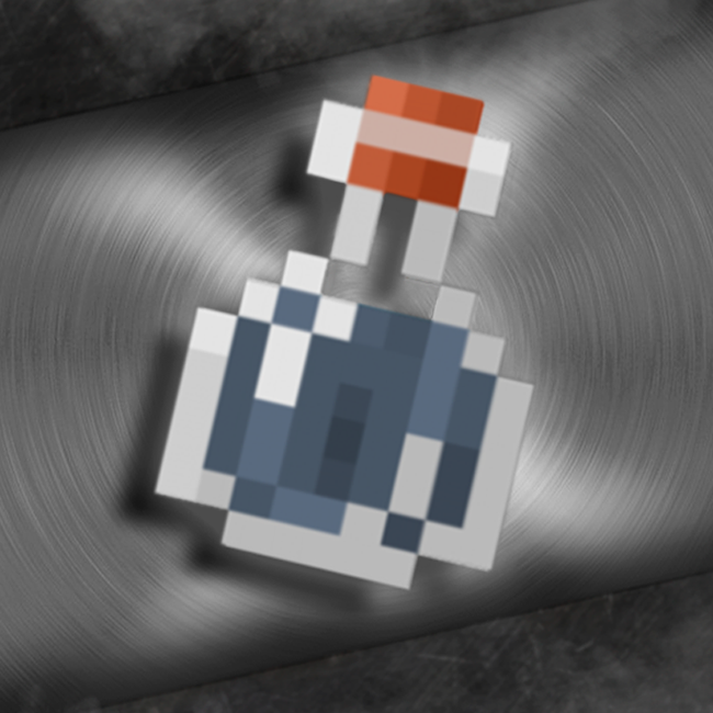
A year or so passed, then Gunther decided it was time to change the icon once more.
This time it was a more simpler design without perspective and a blocky gradient in the background.
And so, they once again sent me a slowness potion variant:
Now being used to the previous potions for over a year, this was quite a drastic change in colors… (Nowadays this looks really cursed to me) And so I took some liberties in changing a few things… First up, the color of the potion needs to be similar to the old one…

The speedrunning potion also had the same background, which didn’t look to good in my opinion, when viewing it next to each other…
To fix this, I took the background and rotated it 180°

And the rest is history
Splitting off
Then another year passed and in 2020 Gunther switched to yet another potion design:

At that point, I have used the potion in various different places, so I refused to changing it again. And that is the story of how we had matching potions with the speedrunning guild.
The official ones
As you may have seen, the previous icons were a bit low resolution.
To fix this, I remade the icon as a vector and bumped up the quality.
For now this is the official icon I use everywhere:

Later on, Pancake would create LoTAS, our tools for Low optimzation TASes.
I proposed the idea of using a splash potion as the icon, since Low Optimization/Low Accuracy is fitting with the theme of a splash potion:

The secret one
1.14 introduced a new resourcepack with a new design for the potion. In preparation to switch, I made the following, but never went through with this design:

Alterations
We decided to split our different TAS categories in sections. TAS-Battle, TAS-Competition and TAS-Development
And each of these section got their own logo and color scheme.
TAS-Battle
As a strength potion
TAS-Competition
As a luck potion
TAS-Development
As a potion of harming
… no comment
The funny ones
Here we have a collection of icons used for different events and random ones…
Halloween
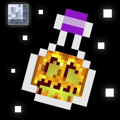
April fools

of course LoTAS has one too:

Animated
And finally here is the animated version I made:
